You want your social media wall or hub to look amazing. We want to make creating beautiful walls easy, so we’ve prepared a handy little guide for you.
This article aims to teach you how you can make the best use of Wallery app. If you find yourself wanting something different – something special – remember you can always contact us via this form, or by reaching out to us by email at [email protected]. Share your crazy ideas with us and together we will make them happen!
Preparing your logo
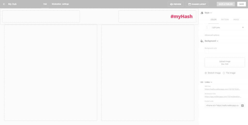
Wallery enables you to display your logo in the header of your walls or hubs. Your walls and hubs will be seen by hundreds and thousands of eyes, which makes this a valuable marketing opportunity. It is important that you make the most of it.
Optimum logo size
Default size for Wallery header images is 96 pixels in height.
Whether your logo is bigger or smaller, when you choose to upload it into the header it will be scaled to this height, so prepare your file at 96 px in height. Better yet, upload your logo in double this height (192px), and Wallery will scale it down by 50%. This logo will now appear smoother on most screens, especially retina or other high fidelity desktop screens or mobile devices!
Logo background
Pay special care to the background of your logo. If you’ve made the header of your hub transparent, it could look strange if your logo is sitting on a white background. Uploading a .PNG file with a transparent background will solve this problem.
However, if you’re using a photo or tiled background, logo with transparent background might lose its legibility and panache.
Displaying mission statements
If you have a special sentence or a claim (maybe it’s a part of your branding) that you wish to use in the header of your hub, remember that not all fonts are available, so maybe it would be better to upload it as an image (for instance .PNG with transparent background). If you decide to do this, remember what we’ve mentioned above and double the size of your image in order to get a crisp, sharp image in the header.
Check your brand book
When choosing background colors or images for your header, or body, remember to check your brand book and see if there is anything already set by your design team. Also, keep in mind that backgrounds should be in contrast with frontend content (images, text) to achieve the best readability.
Pro tip: When scaling down images in the header, it’s important that you remember not only filled (visible) pixels will be scaled down, but also their transparent surroundings. So, if you want your logo at 96px height, please crop your logo without borders/margins in the logo file.
![]()
Wallery and typography
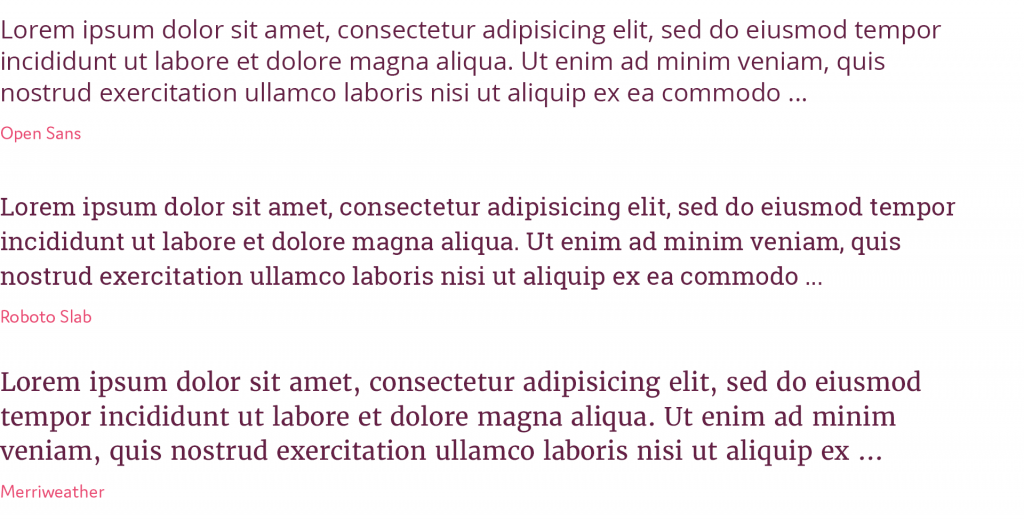
Currently supported fonts
All paid Wallery users can choose between a couple of fonts when designing their walls. These are:
- Open Sans
- Roboto Slab
- Merriweather
More fonts will be implemented soon, so keep an eye out!
Using your own font in the header
If you would like to use any unsupported typography, you’ll have to upload it as an image. Mind the image width and height and remember that all images will be scaled to fit the height of the header.
Typeface color
For best effect, set your type in clear and contrasting color over the background.
Typeface size
Size is important for readability, but be careful your typeface doesn’t overshadow your brand or social media content displayed on the wall.
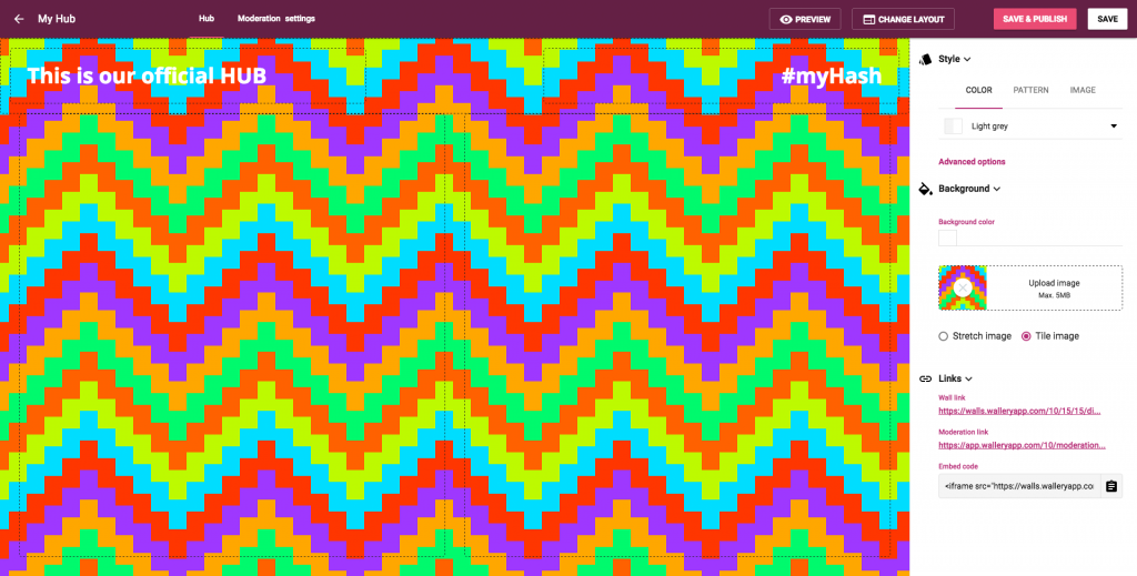
Choosing best image/pattern tile for global hub background
Choosing the right background
Your social media content will be displayed over this background, so choose an image/pattern tile that won’t badly affect readability of this content, or your brand.
Plan ahead
Keep in mind that social content is displayed in white rectangles which float over the background, but also that images that are part of these boxes could extend to the very edge of the containers, so it could clash with a badly chosen background.
Patterns are fun, but…
Remember that very busy patterns may destruct your users from reading the content of social media posts.
Can you really use that image?
Be very careful with downloading images from the internet. Not all images are allowed to be used without explicit permission from their owners, or for free.
Pro tip: You can’t prepare perfectly for every occasion; meaning not ALL images published by Twitterers and Instagramers will fit your color scheme as you had planned or envisioned it. That’s okay, though! The beauty of social media lays in its genuine and flexible nature.
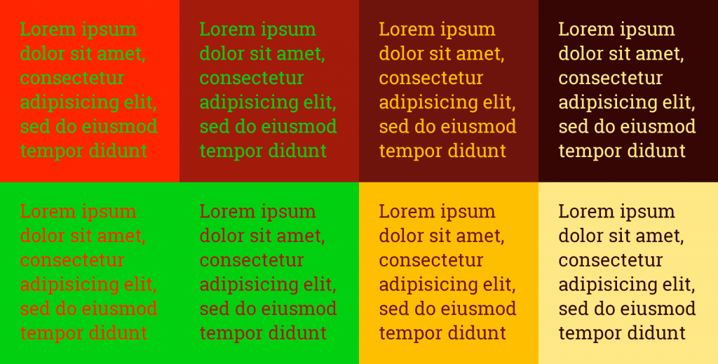
Colors
Of course colors depend on your brand, message, audience etc. It may be serious, cheerful, colorful or in fifty shades of grey. They should augment your content, not obstruct it. Keep them in good contrast, but not to much (for instance bright red/green). If you’re not sure about color combinations, don’t hesitate to ask your designer or favorite search engine.
Hashtags!
It is essential that you display your hashtag or hashtags on your social media wall. They are a doorway to your wall, after all. If social media users aren’t sure how to contribute, they’ll get annoyed, and your wall, brand, event etc. will be ignored.